Jen Zhang
jenramonaz@gmail.comBlueDot Insights
A dashboard solution that tracks global infectious disease risks and contextualizes them to your locations of interest.
BlueDot’s main product, Insights, is a centralized source for global infectious disease surveillance and risk assessments. Having been at BlueDot since the inception of the idea, I have been apart of Insight's design process since it's beta to the dashboard solution it is now. Most recently, I redesigned Insight's full interface and design system during a month long sprint due for end of January prior to my departure.
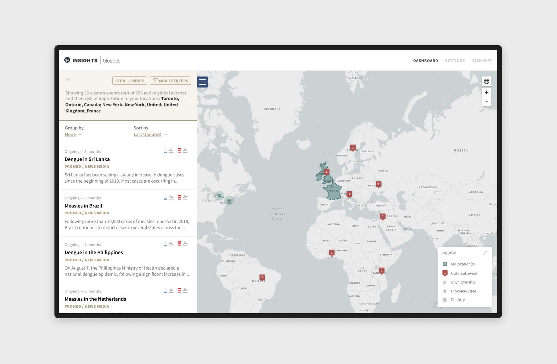
Protecting populations' and staff's risk of exposure to infectious disease
Insights has been carrying out pilots with various users within different sectors whose main goal is to leverage Insights to help protect populations' and staff's risk of exposure to infectious disease. These users include but are not limited to Public Health Networks, Travel and Transportation, IPAC (Infection Prevention and Control), Emergency Management, Defense, and Clinical Medicine.
Various ways Insights' users can utilize Insights include scanning their portfolio of locations for possible risks, analyzing Insights’ detailed risks for a given location within and outside of their portfolio, significant rises in risks, understand disease details including mode of transmission, incubation period, protective measures, and be notified when an event is in or near their area(s) of interest.
Various ways Insights' users can utilize Insights include scanning their portfolio of locations for possible risks, analyzing Insights’ detailed risks for a given location within and outside of their portfolio, significant rises in risks, understand disease details including mode of transmission, incubation period, protective measures, and be notified when an event is in or near their area(s) of interest.
Dashboard Interface
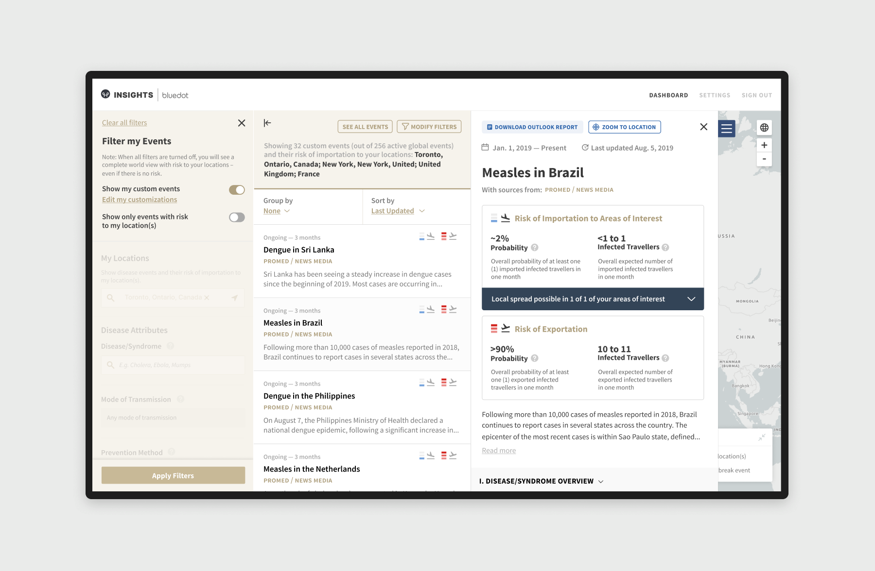
Upon logging into the Insights dashboard, users immediately gain access to 10,000+ offical and mass media sources per day including the WHO, ProMED-mail and more. The surveillance team takes these sources and creates events from around the world which are then displayed on your dashboard. These events are dispayed with their risk of importation to your locations of interest as well as it's risk of exportation to the world. Additionally, the user can know whether or not an imported infectious disease could trigger an outbreak within your locations of interest.
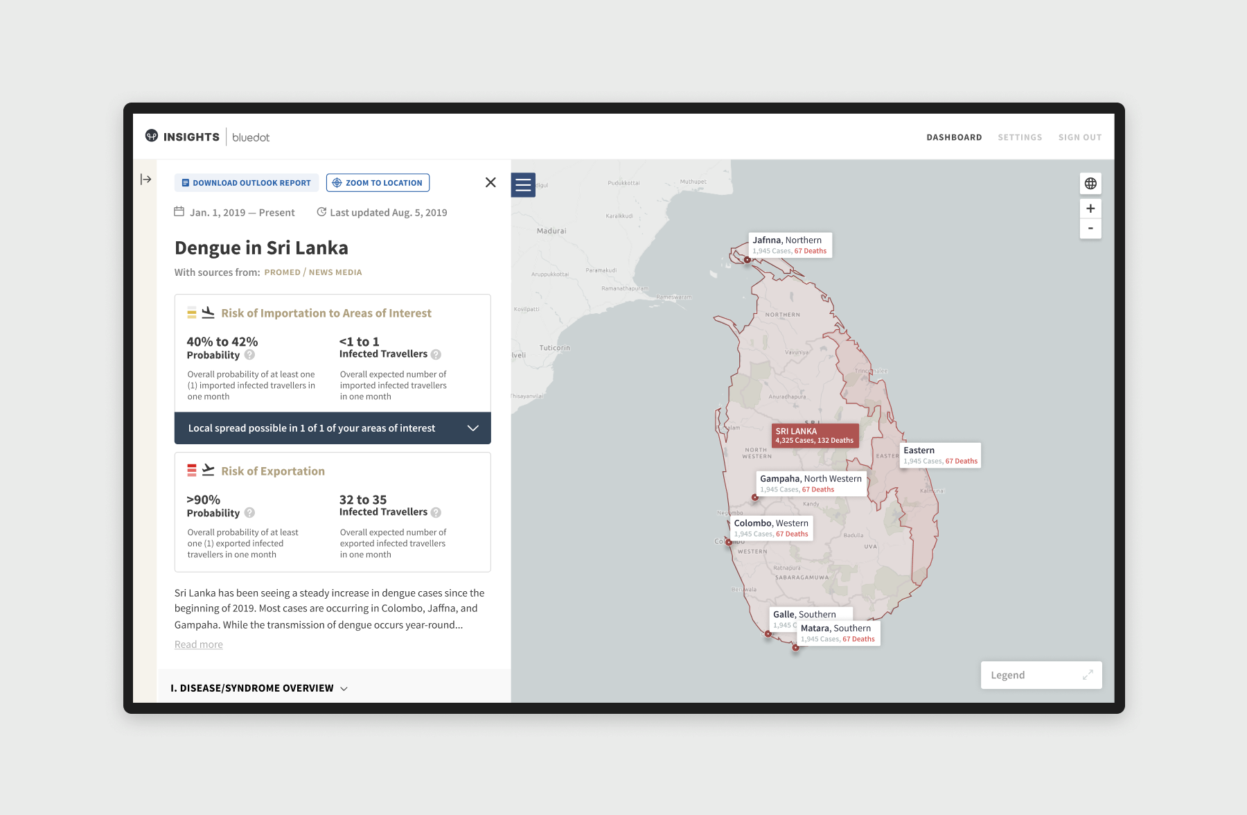
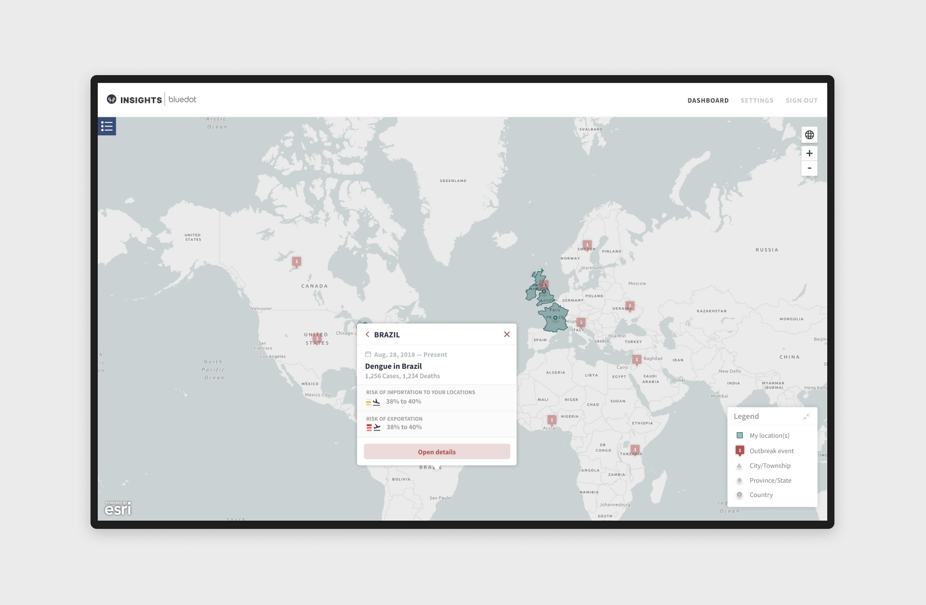
But where does the event actually take place? By providing the user with the outbreak's extent visualized on the map, they can quickly scan through the cities, provinces, or countries that are at risk to their locations of interest. While Insights' experience is optimal as a desktop application, the application can also be used on mobile, triggering a per panel view.
But where does the event actually take place? By providing the user with the outbreak's extent visualized on the map, they can quickly scan through the cities, provinces, or countries that are at risk to their locations of interest. While Insights' experience is optimal as a desktop application, the application can also be used on mobile, triggering a per panel view.
Improving Insights' map features
Our pilot users have consistently expressed the advantages of a map over a mapless dashboard layout for purposes such as self initiated exploration and overall global context. Therefore, we have been continuing to improve features, interactions, and visualizations within our map. Features such as clear indication of our users' area(s) of interest, disease outbreak extents, levels of geography, better zoom controls, mapping at risk airports, and more have been considered.
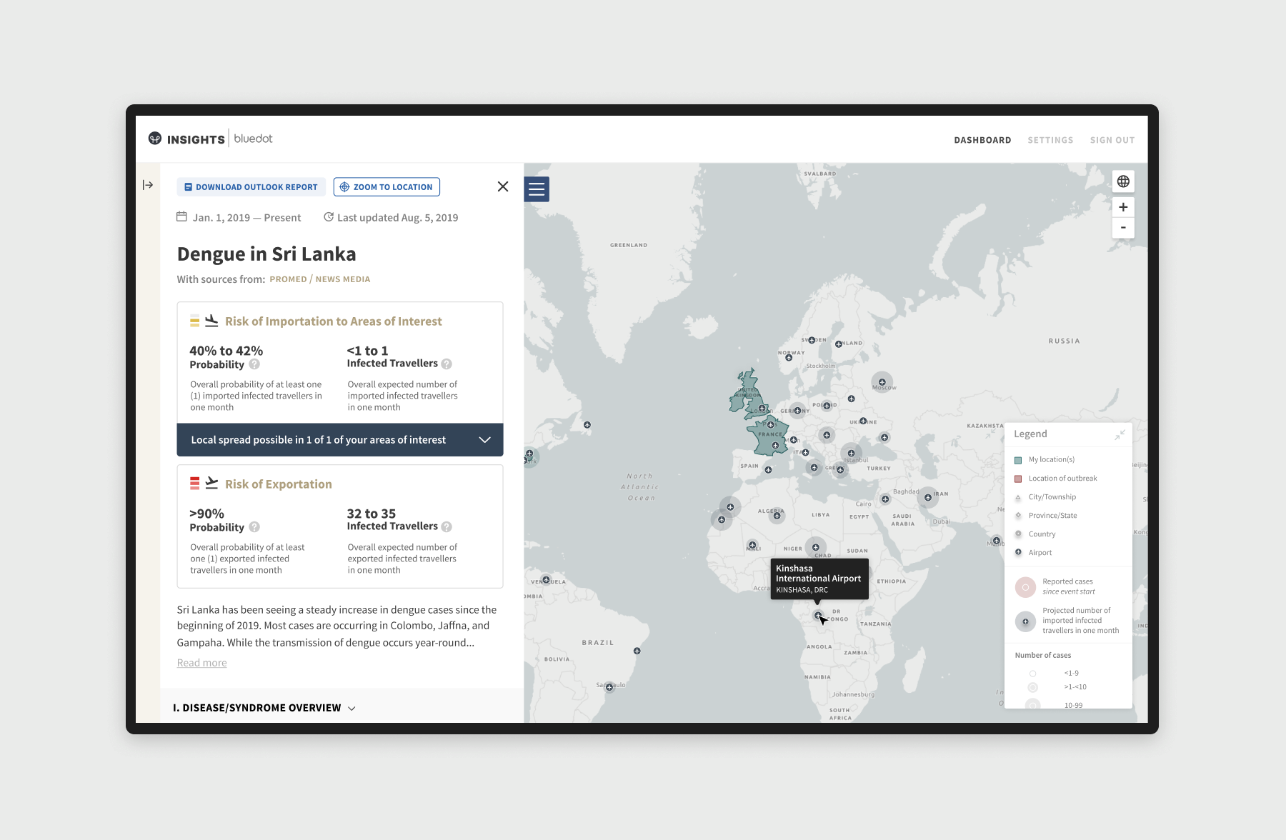
If our users choose to explore events independent of the event list, they are able to interact with map pins for event surveillance. Upon clicking into the pins, users are able to get a quick overview of the risk of importation to their locations, and the risk of exportation. Whenever an outbreak is selected (either via the map or the event list), airports with risk of importation will be visualized on the map, allowing the user to easily see the risk an outbreak poses to the rest of the world.
If our users choose to explore events independent of the event list, they are able to interact with map pins for event surveillance. Upon clicking into the pins, users are able to get a quick overview of the risk of importation to their locations, and the risk of exportation. Whenever an outbreak is selected (either via the map or the event list), airports with risk of importation will be visualized on the map, allowing the user to easily see the risk an outbreak poses to the rest of the world.
Near real-time disease alerts based on your location
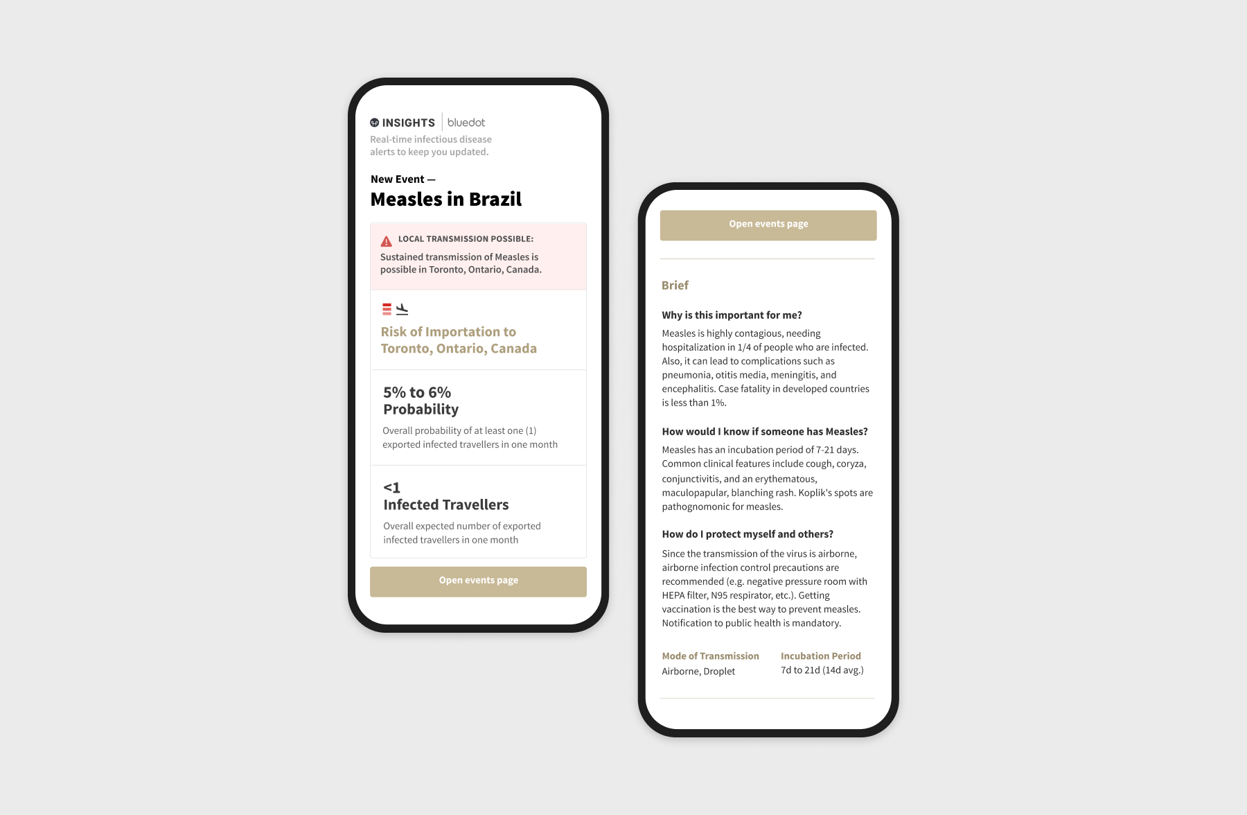
Insights users can choose to receive notifications for new outbreaks relevant to their area(s) of interest, new cases in or near their area(s) of interest, and weekly outbreak summaries relevant to their area(s) of interest. Additionally, upon onboarding, users must select one of several pre-defined roles which comes with one or more pre-defined disease lists. These lists serves as the user’s baseline of diseases that they will be notified about. At anytime, they can customize the disease list and choose between, “always of interest”, “if it’s a risk in/to my location(s)”, and “do not notify.” Afterall, Insights' primary goal is to deliver near real-time infectiouse disease alerts based on what's relevant to you.